
Display a modal using Vue and its Teleport component
Photo by Alek Kalinowski on Unsplash
How to quickly implement a modal with Vue using its built-in Teleport component.
You will find a sample Laravel project on this Github Repository.
While using a modal might seem obvious on a website, its implementation can sometimes be complex. To simplify this task, the Vue framework has introduced its built-in component <Teleport>. This component allows us to “teleport” a portion of a component's template into an existing DOM node outside of the component's DOM hierarchy.
Let's now determine the location of this external node by assigning the id capsules to Welcome.vue.
/resources/js/pages/Welcome.vue
<script setup>
import logotype from '/public/assets/capsules-logotype-red-blue-home.svg';
</script>
<template>
<div id="capsules" class="w-full min-h-screen flex flex-col font-sans text-primary-black">
<div class="grow mx-8 lg:mx-auto max-w-screen-lg overflow-auto flex flex-col items-center justify-center text-center">
<img class="w-24 h-24" v-bind:src="logotype">
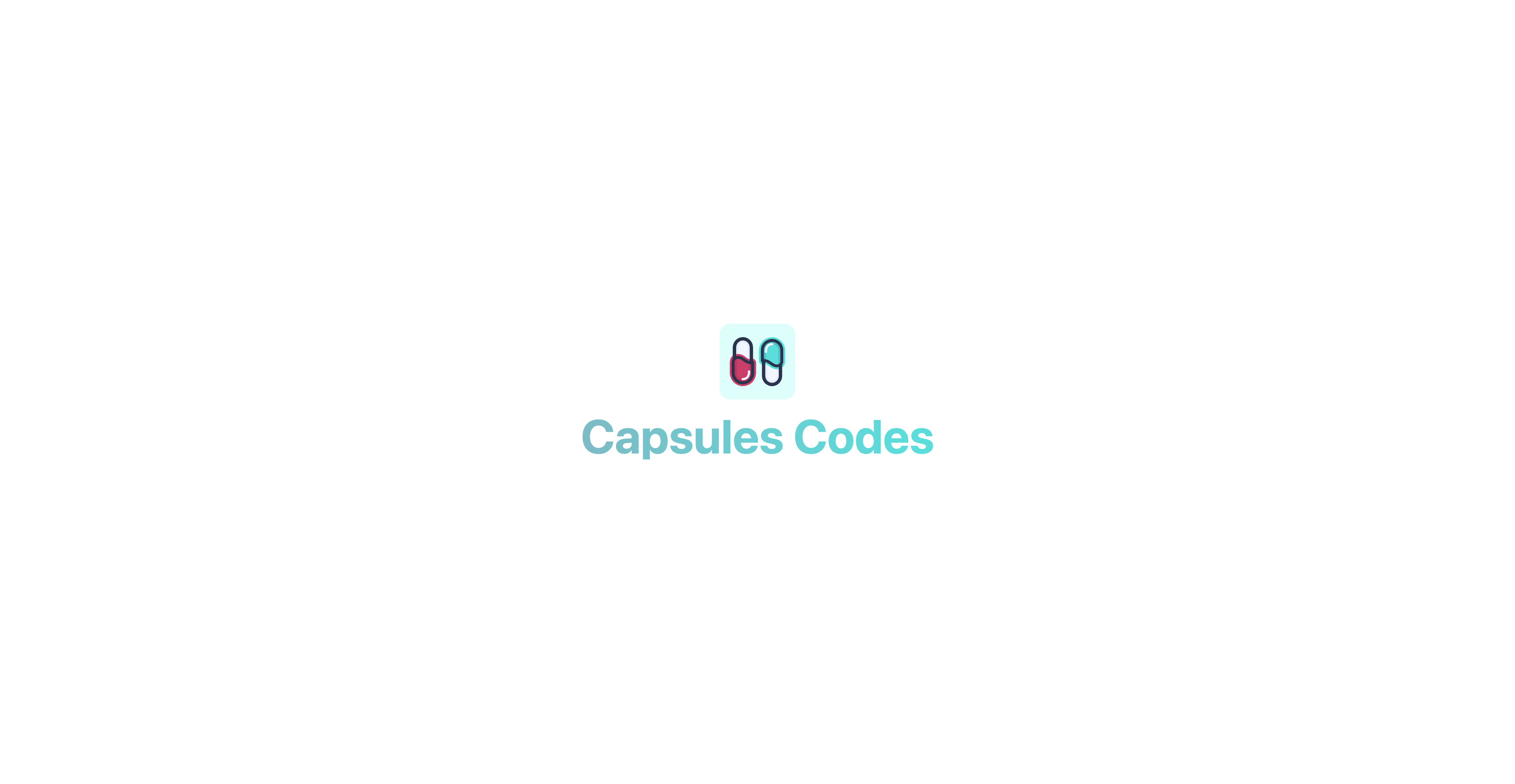
<h1 class="mt-4 text-6xl font-bold select-none header-mode" v-text="'Capsules Codes'" />
</div>
</div>
</template>
This Vue component is, in fact, an InertiaJS page called when accessing the main route specified in the web.php file.
routes/web.php
<?php

use Illuminate\Support\Facades\Route;
use Inertia\Inertia;

Route::get( '/', fn() => Inertia::render( 'Welcome' ) );
With the id capsules now assigned, the Modal.vue component will be able to use the built-in <Teleport> component on this element.
/resources/js/components/Modal.vue
<script setup>

import { ref, onMounted } from 'vue';

const props = defineProps( { open : { type : Boolean, default : false } } );
const emits = defineEmits( [ 'toggle' ] );

const ready = ref( false );

function toggle()
{
    emits( 'toggle' );
}

onMounted( () => ready.value = true );

</script>

<template>
    <Teleport to="#capsules" v-if="ready">
        <Transition enter-active-class="duration-500 ease-in-out" enter-from-class="opacity-0" enter-to-class="opacity-100" leave-active-class="duration-500 ease-in" leave-from-class="opacity-100" leave-to-class="opacity-0">
            <div v-if="props.open" class="fixed w-full h-full flex items-center justify-center backdrop-blur-[1px] bg-primary-white bg-opacity-50" v-on:click="toggle()">
                <div class="relative m-16 p-2 rounded-xl flex flex-wrap items-center justify-center text-xs bg-white whitespace-pre shadow-2xl shadow-black/10" v-on:click.stop>
                    <slot />
                </div>
            </div>
        </Transition>
    </Teleport>
</template>
The ready variable allows the component to load so that it can trigger its Transition as smoothly as possible.
The v-on:click.stop event, on the other hand, prevents any potential click propagation to elements other than the modal itself.
The built-in <Transition> component can be used to apply entrance and exit animations to elements or components passed to it through its default slot. In this case, it involves a smooth opacity transition.
With the modal configuration completed, it is now time to create a component that will enable the display of this modal. In this case: a button.
resources/js/components/Button.vue
<script setup>
import { ref, watch } from 'vue';
import Modal from '/resources/js/components/Modal.vue';
import logotype from '/public/assets/capsules-logotype-red-blue-home.svg';
const button = ref();
const isModalOpen = ref( false );
watch( () => isModalOpen.value, () => isModalOpen.value ? window.addEventListener( 'click', clickOutside ) : window.removeEventListener( 'click', clickOutside ) );
function clickOutside( event )
{
if ( event.target === button.value || !event.composedPath().includes( button.value ) ) isModalOpen.value = false;
}
</script>
<template>
<div ref="button" class="m-4">
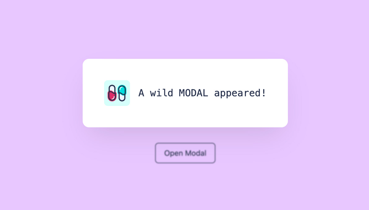
<button class="px-4 py-2 text-sm rounded-md border border-primary-black hover:border-primary-red hover:text-primary-red transition-all" v-on:click="isModalOpen = true" v-bind:class="{ 'opacity-25' : isModalOpen }" v-bind:disabled="isModalOpen" v-text="'Open Modal'" />
<Modal v-bind:open="isModalOpen" v-on:toggle="isModalOpen = false">
<div class="p-8 flex flex-row space-x-4 rounded-lg">
<img class="w-12 h-12 select-none" v-bind:src="logotype">
<div class="font-mono flex items-center">
<h2 class="text-lg align-middle" v-text="'A wild MODAL appeared!'"/>
</div>
</div>
</Modal>
</div>
</template>
A variable button is created and associated with the parent div of the Modal, allowing us to monitor any clicks made outside of this component. A watcher is used to observe the isModalOpen variable, determining whether the clickOutside function should be triggered when clicking on the screen. If the Modal is open, the function is activated; otherwise, it is not.
The Button.vue component can be added to the Welcome.vue page.
resources/js/pages/Welcome.vue
<script setup>

import logotype from '/public/assets/capsules-logotype-red-blue-home.svg';

import Button from '~/components/Button.vue';

</script>

<template>
    <div id="capsules" class="w-full min-h-screen flex flex-col font-sans text-primary-black">
        <div class="grow mx-8 lg:mx-auto max-w-screen-lg overflow-auto flex flex-col items-center justify-center text-center">
            <img class="w-24 h-24" v-bind:src="logotype">

            <h1 class="mt-4 text-6xl font-bold select-none header-mode" v-text="'Capsules Codes'" />

            <Button class="pt-8" />
        </div>
    </div>
</template>
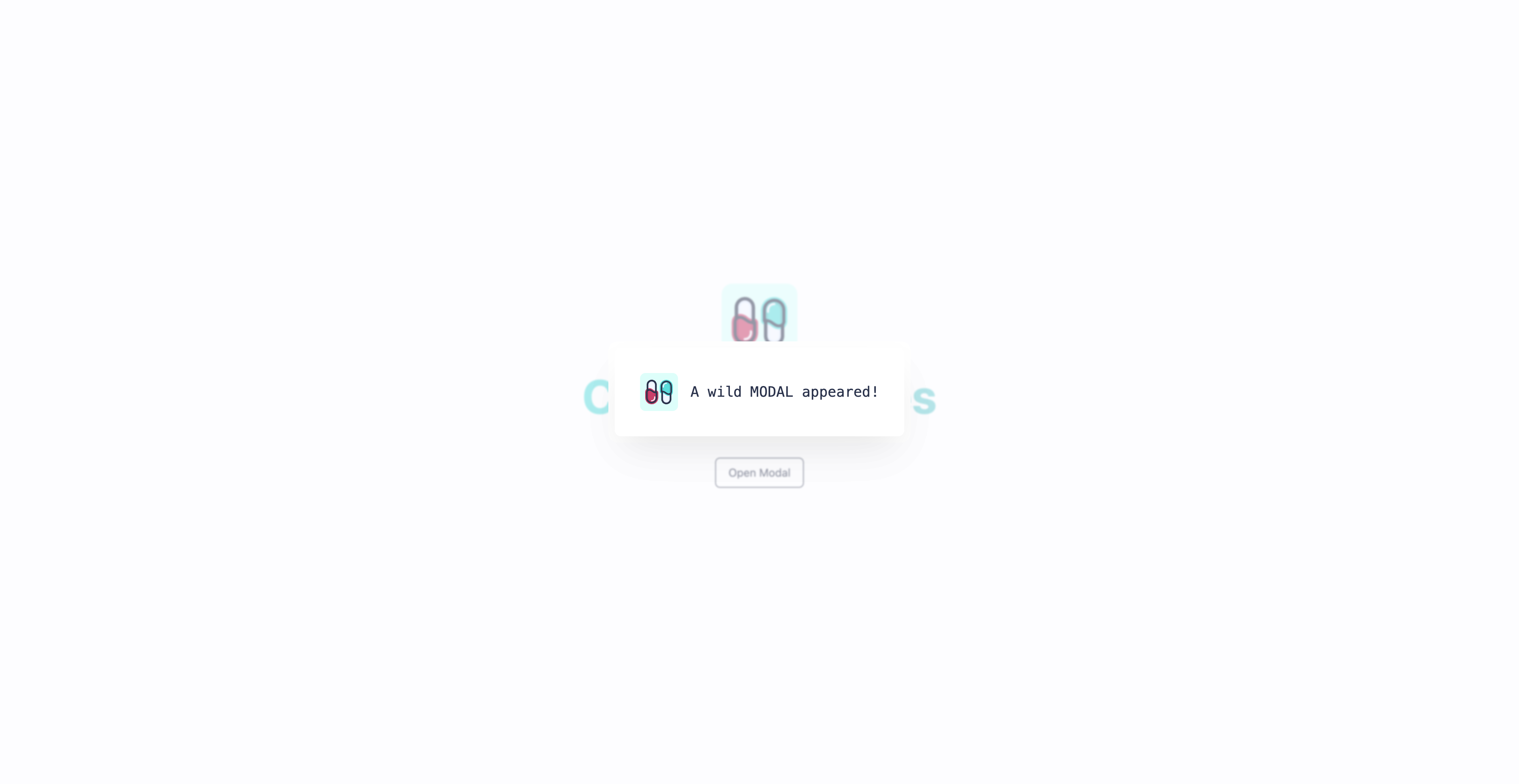
The Modal appears when clicking the button. It is now possible to customize the modal as desired: its position, dimensions, and actions. The Reaction component implemented on the Capsules Codes Blog is also the result of this method.
Glad this helped.
Other articles you might like
 June 13th 2026
Building a Production MCP Server in Laravel
Spec version notice: This article targets MCP specification version 2025-11-25. The protocol has sh...
 May 30th 2026
Evals in Laravel: How to Prove Your AI Output Is Actually Good
You shipped the ticket classifier last quarter. It works. The tests are green and they've stayed gre...
 April 28th 2026
Event sourcing with a little help from AI
Event sourcing in Laravel gives you a complete history of your domain, but the hardest part isn't wr...


The Laravel portal for problem solving, knowledge sharing and community building.